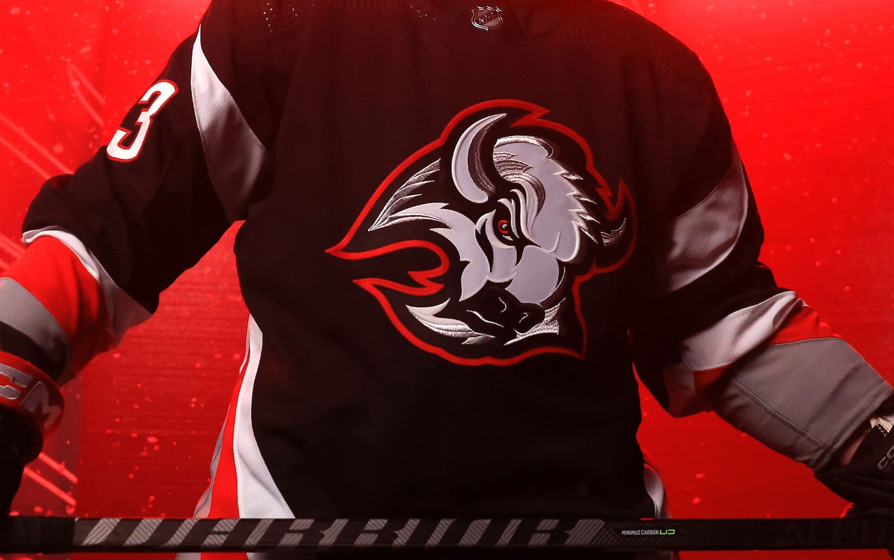
Buffalo Sabres reveal red, black and white Goat Head alternate jersey

It’s back, everyone!
The Buffalo Sabres have officially revealed their newest alternate jersey, returning to the team’s red, black and white look they donned from 1996-2006.
It’s not the team’s first usage of the logo this season, utilizing it on the new Reverse Retro uniform. Still, it’s the return of the red and black colors that sparked much conversation about the team’s utilization of it in the mid-90s. But nostalgia sells, and it’s clearly a popular choice among fans.
When history merges with the present… Black and red is BACK. 😤
This is the first time the team has used these colors since switching to the controversial Buffaslug design for the 2006-07 season. The Sabres found some relative success in the Goat Head era, making the Stanley Cup final in 1999 and the Eastern Conference Final in 2006. They made the conference final again with the Buffaslug the following year but haven’t won a playoff series since.
Maybe, with the Sabres showing some muscle this year, this is somewhat of a good omen.

The design is a more modern take on the previous design, built to work with Adidas’ current uniform. The B with the saber cutting through returns on the shoulder, with the main Goat Head logo getting a slight re-coloring.
The Sabres will wear it for the first time against the St. Louis Blues on Wed., Nov. 23 and will wear them a total of 12 times. The jersey is for sale on Buffalo’s website right now.
