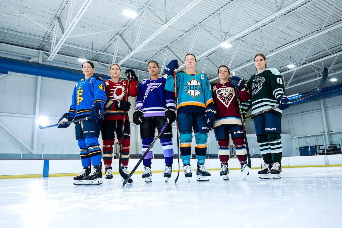
PWHL, Bauer unveils new jerseys for 2024-25 season

We know what the six franchises of the Professional Women’s Hockey League will be looking like when they hit the ice for their second season.
On Thursday, the league, in partnership with Bauer, revealed the new uniforms each team will start wearing for the 2024-25 season.
Puck drop on Season Two has never felt closer. Experience our new jerseys for the first time alongside a few of your favorite players.
In September, the PWHL announced new branding for the founding six teams–the Boston Fleet, Minnesota Frost, Montreal Victoire, New York Sirens, Ottawa Charge and the Toronto Sceptres.
Each team has taken colors similar to what they wore during the inaugural season, with a few added details to make each team unique as the PWHL continues its rapid growth.
Our home threads. Be one of the first to secure our official replica jerseys. Early access available exclusively at shop.thepwhl.com
Boston’s jerseys have a good mix of forest green with teal and white mixed in for their home jerseys, with the cool reverse-trident logo they introduced in September. The away jersey features a traditional white-based sweater with dark green shoulders. The numbers have a unique wave reinforcing the city’s seaside heritage.
The Frost’s two jerseys more or less have a nice flip to them, as the multi-colored ‘F’ logo highlights differently in their home and away jerseys. A dark purple shoulder on the away unis is contrasted by a cool white on the home ones.
The Victoire still have the maroon that was more of a secondary color on the teams’ unis last year, using it as the base for their home sweaters this year. The cool dark cream is used on the away jerseys, with a Fleur-de-lys motif being etched into the numbers and other parts of the uniform.
Our away threads. 🛍️ Early access to official replica jerseys exclusively at shop.thepwhl.com
The Sirens have a very California Golden Seals vibe to them. The added yellow-orange stripe, along with the base Lady Liberty green, gives the jerseys an old-school look with their new logo. The “added vibrations” of New York’s crest make this jersey stand out.
People have given a lot of flack for how the Charge looks like the Calgary Flames, but I think it works. There are noticeable pulses around the jersey to signify the energy the team and its fanbase bring every game. The numbers themselves are also different from the other team’s sweaters, setting them further apart.
The blue that many associated PWHL Toronto with in year one is still prevalent in the Sceptres’ jerseys. The added yellow tint in both the home and away sweaters compliment the team’s striking new logo.
The second PWHL season is set to begin on Saturday, Nov. 30, with the Sceptres hosting the Fleet, and the Victoire facing off with the Charge. The Sirens and Frost will begin their new campaigns on Sunday, Dec. 3.


