Hometown Remix Superlatives: The best, worst, and wildest of the NHL’s new uniforms

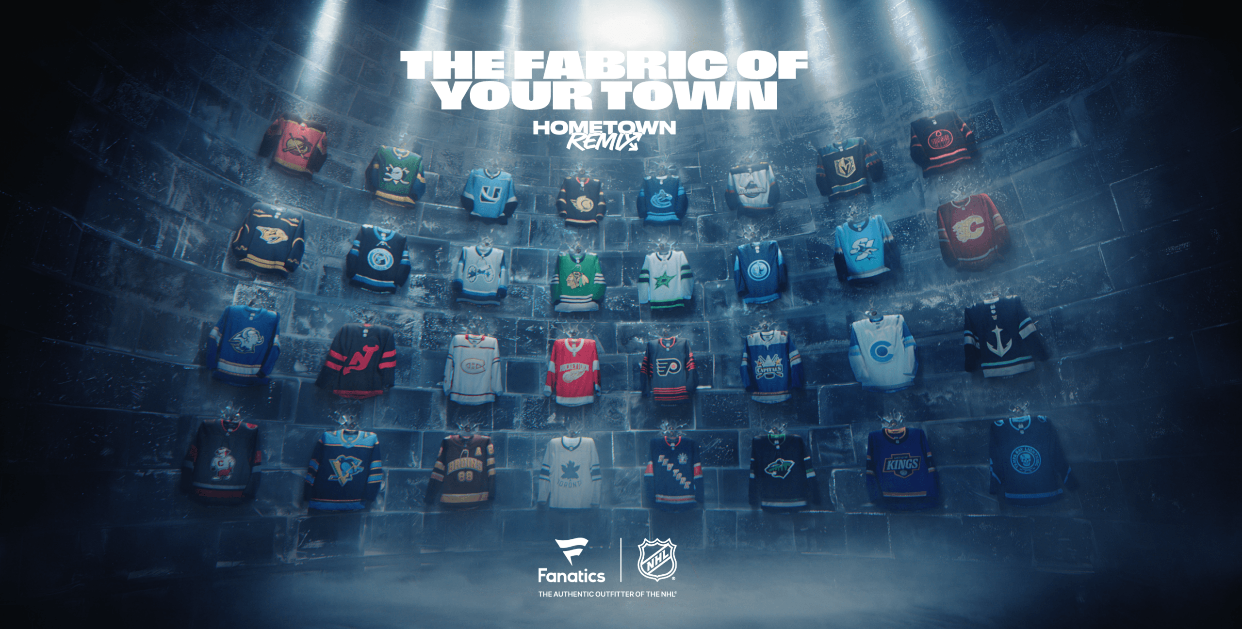
After much anticipation (and many leaks), the NHL and Fanatics, its official uniform partner, finally unveiled the Hometown Remix line of speciality jerseys on Monday.
As a spiritual successor to the two Reverse Retro programs the league debuted in collaboration with Adidas in recent years, the Hometown Remix line allows each of the NHL’s 32 teams to introduce new designs with distinct ties to their city and hockey community.
It’s a fun exercise that gives hockey fans something to discuss (and, of course, argue about) in the early stages of the new season. Naturally, we here at Daily Faceoff have taken it upon ourselves to do just that.
We’ve assembled a star-studded panel of news writers and columnists to give out a handful of superlatives to the teams that stood out the most — both positively and negatively — with their Hometown Remix designs. I, Mike Gould, led the charge on this assignment, with my colleagues Steven Ellis, Scott Maxwell, Hunter Crowther, Tyler Kuehl, and Kyle Morton gamely taking part.
Without further ado, let’s start at the very top and work our way forth from there.
Which jersey looks the best?
Mike: I really like what the Washington Capitals put together. I’ve always been a sucker for the Caps’ late-1990s color scheme, and I think the light blue, bronze, and white look especially great with that jersey template and their Capitol Building logo. I also really dig the angular typeface they’re using for the nameplates and numbers. I think it’ll look fantastic on the ice. I also really like the Los Angeles Kings leaning fully into purple again, as well as the San Jose Sharks making an arm striping pattern out of shark teeth.
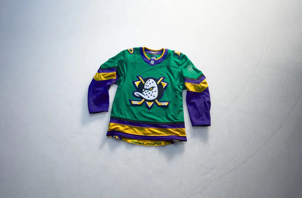
Tyler: If you don’t like the Ducks’ remixes…then clearly you don’t love hockey. We were happy when they brought back the Wild Wing logo a few years ago, but going all out with the green and gold from the first Mighty Ducks film absolutely checks all the boxes. Sure, they didn’t go all out with the District 5 logo, but seeing those jerseys in an NHL game will be something else.
Steven: I’m with Tyler – the Ducks jersey is wicked. I also love Los Angeles because purple is a highly underutilized jersey color. I still can’t believe the team with the purple and gold look decided to go with grey, black and white for their full-time digs. Brutal.
Kyle: I haven’t consumed quite enough discourse yet to know how hot of a take this is going to be, but I feel like it will be controversial when I say that I absolutely love these San Jose Sharks jerseys. This is an unserious concept as a whole, and including the gums and teeth on the sleeves is the exact correct amount of whimsy to throw into one of these looks. The teal is money in the bank to me every single time, and I like the “SJ” wordmark and this new version of the logo.


Cap Summary
Draft Picks
Scott: How has no one mentioned the Panthers yet? We’ll get to see a team wear a pink jersey in an NHL game for the first time ever (don’t fact-check me on that), and I think it’s awesome to see a team do something different. I’m also just a sucker for the Miami Vice colour aesthetic, so sign me up for that on a jersey.
I do agree with some of the other shoutouts… the green and gold Ducks jerseys and purple and gold Kings jerseys are also very nice. I’m not often a fan of the Penguins’ attempts at baby blue jerseys, but I really like how this one turned out.
Hunter: I hate to hop on the bandwagon, but the Ducks jerseys are the best of the group. I still can’t get over the idea of taking the sweater concept from a goddang Disney movie from the early ‘90s, which yes, was the inspiration of the movie itself, and making it work in 2026. Green is already an underutilized color in the league and to blend it with the purple and the iconic Ducks’ hockey mask … it’s the cream of the crop.
Which one looks the worst?
Mike: I truly have no idea what’s going on with that Tampa Bay Lightning jersey. What in the world does a skull have to do with the Lightning? You’re telling me it’s an homage to the Stadium Series jersey they wore … earlier this year? The lightning pattern on the arm looks alright — I guess — but everything else about it screams “first draft.”
Steven: What the heck was Montreal thinking there? I don’t love the all-white look, and I have a few of their white jerseys. I just wish the logo had some actual color there. I wish we got an updated version of the white alternate that they wore in the 2000s (the white version of the home jersey). That was my favorite growing up.
Kyle: There are a lot of contenders for the worst. Like Steven, I gave much consideration to Montreal here, but I’m going to land on another Canadian team and say Edmonton. Black jerseys are already overdone in the NHL, and it really grinds my gears when a team that has such a gorgeous, iconic look shoehorns a black jersey into its uniform mix for no reason. It’s one thing for teams with black in their color scheme like Ottawa, Carolina, Philadelphia, etc. to throw out maybe one too many black jerseys over the years, but the Oilers simply cannot be doing this.
Tyler: Kyle is onto something here. I know Montreal gets a lot of flak…but can I say how lazy the Oilers are here? Yes, the charcoal base gives those “Oil Country vibes,” but they literally look like they just took those bland navy blue and orange jerseys and changed the color ever so slightly. It feels like what the Islanders did when they just brought back their early 2000s sweaters during the Reverse Retro era. I would’ve done something with the oil-drip logo alternates they used to wear, but I’m just a simple hockey writer.
Hunter: How have none of you written “the Boston Bruins” as an answer? The brown and gold color scheme deserves to be in a toilet bowl instead of on a hockey rink. Even the most generous critics of the jerseys would call these a direct knockoff of Major League Baseball’s San Diego Padres. The Cleveland Browns may be professional sport’s most unsuccessful team, but at least they knew how to make a brown jersey look respectable. In Boston, they’ve made it a laughing stock.
Mike: Call me crazy, but I kinda like what Montreal put together. The jersey itself doesn’t have a ton of color, but it’s going to be worn with red helmets and pants. In that sense, it sort of reminds me of the Detroit Red Wings’ 2021 Reverse Retro jerseys, which a lot of people clowned on but actually looked alright on the ice.
Scott: I agree Mike… agree with you giving me permission to call you crazy. I get that it’s tough for a team with one jersey in their history to do something different, but it looks like they started on it last minute, did the jersey design and forgot to colour it in.
That said, no jersey is worse than a boring one, and that’s what we got from the Rangers. Everyone knows that when it comes to jerseys, I hate the Rangers’ bland college hockey layout (seriously, they have a nice logo but don’t use it?) and the colour navy blue on a jersey, and they went and used both of them. Yawn. I feel like I’ve seen them churn out this jersey a million times before. When so many teams at least tried something new, the Rangers dropped the ball here.
Which team did the most with the assignment?
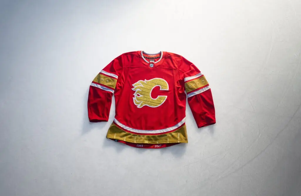
Mike: I have to give a shoutout to my hometown Calgary Flames, who really met the assignment and then some with a Saddledome-inspired jersey. I absolutely love the inclusion of gold, a completely new color for this Flames team, and I think the Saddledome-shaped waist striping pattern is absolutely genius. If you’ve spent any length of time in that building, you’ll truly appreciate all the little touches they put into this jersey. I think they nailed it.
Kyle: Calgary. What Mike said. Honorable mention to Florida.
Steven: Calgary.
Tyler: As much as I want to be different…the Flames really nailed it. Sure, there were other teams who tried to tie things together, but a lot of them were just simple throwback colors.
Scott: I agree with the Flames sentiment, and also think the same with the Sabres, but I’ll give another surprise shoutout to the Predators. As much as I detest navy blue, it’s always been a part of Nashville’s colour scheme, and I thought they executed a navy blue look very well, especially by incorporating the gold logo and accents. I love an all black jersey with team colour flares (see Edmonton, Minnesota, Vancouver), and this is the navy blue version of that, so I can accept the use here. Winnipeg did the same thing, and I like theirs too, especially the way they fade the colours into each other.
Hunter: I’ll offer the Capitals as another option on the podium. Whoever decided to combine their black U.S. Capitol sweaters of the late ‘90s and early aughts with the blue color scheme from the early-to-mid ‘90s made a great choice.
Which team did the least?
Mike: You mean to tell me the New Jersey Devils haven’t already worn those jerseys before? They basically just looked like a color-swapped version of what they wore in the 2024 Stadium Series. They had such a cool opportunity to do something unique and instead delivered something completely derivative. At least Devils fans seem to like it. Dishonorable mention to the Chicago Blackhawks, whose new green jersey looks like something you might’ve seen on the NHLshop.com clearance page 15 years ago.
Steven: I know Detroit loves to play up the Hockeytown nickname, but it feels so cheesy here. But, more importantly, this just feels like they moved a few stripes around and called it day. I wish they did something more unique here.
Tyler: Dallas looks like they just decided to take those Monster Energy jerseys, but made them white. Also…look around Dallas and the mainland of Texas…what is green about Dallas? If you wanted to tie into the Hometown vibes, you’d have to have a little more Americana.
Kyle: Good answers from my colleagues here, but I’m going to go in a different direction and say Minnesota. I’m aware that there are sublimated celestial constellations here, but you’re not going to be able to see those on a broadcast. It’s just a black jersey with their normal logo in a different colorway, and it is frankly uncomfortable how much it looks like a Dallas jersey given the history there.
Hunter: Are we being serious with the Blackhawks sweaters? Did they think fans didn’t have to just google “Chicago Blackhawks St. Patrick’s Day jerseys” to see that they’ve done this before? I know we’ve got some lazy options among the 32 teams, but did any others just copy-and-paste theirs?
Scott: The point of the hometown remix jersey is to pay tribute to the local markets in one way or another. So then why are the Blue Jackets, a team named after and playing in a state that was on the Union side of the Civil War, going with Confederate uniform colours for their jersey? Talk about completely missing the point of your own brand. It’s like the people who unironically think “Born in the USA” by Bruce Springsteen is a pro-patriotism song. If that isn’t missing the assignment, I don’t know what is.
Hunter: I mean, the Ohio Union soldiers did wear grey at the start of the war, but it did lead to massive confusion and the Ohio troops eventually switched to blue, hence the name “Blue Jackets.” Yeah, it’s unforgivable.
Which jersey would you most like to wear yourself?
Mike: I wasn’t expecting to like that Philadelphia Flyers jersey as much as I do, but that color scheme actually looks really cool. Sure, maybe it’s a little muted, but I just think it looks sophisticated, and the Flyers’ black logo looks striking against a charcoal base. It’s the kind of jersey I’d feel good wearing overtop of a hoodie. I love the little homages to the Liberty Bell sprinkled throughout the design.
Steven: Get me a Kings goalie jersey, ASAP.
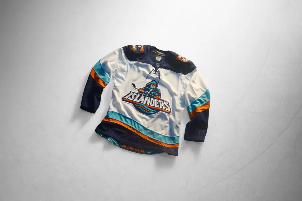
Kyle: Islanders, and it’s not even close.
Tyler: Fisherman Jack babyyyy!
Hunter: Quack … quack … QUACK … QUACK … *bangs table with clenched fists* QUACK QUACK QUACK
Scott: In a few weeks time, you can find me grinding Grand Theft Auto VI, cruising the streets of Vice City while sporting a pink Panthers jersey. Wait, Pink Panther??? Uh oh…
Which jersey would make the best alternate beyond this season?
Mike: I would be 0% shocked to see the Buffalo Sabres and Florida Panthers keep their jerseys around as alternates going forward. That Sabres jersey is unbelievably classy and I think it’ll look fantastic on the ice. As for the Panthers … this Miami Vice-style pink look just perfectly matches the swagger the team plays with, and they don’t currently have a full-time alternate jersey. Seems like this one is tailor-made to fill that void.
Steven: Can’t go wrong with Anaheim. As much I liked their black and orange look they had for a while, you can’t go wrong with one of the best logos in the game. I’m not huge into green jerseys, but I feel like this one is a true winner.
Tyler: I’m going to cheat and give you two…the Mammoth and Capitals. For one, Utah does kind of need a third jersey, and the simple ‘U’ and baby blue will tie in well with the fanbase. The Capitals work very well with the throwback outline and the U.S. Capitol logo…though I would’ve preferred to see the Screaming Eagle return.
Kyle: I think this is Anaheim for fairly obvious reasons. There’s been an identity crisis of sorts going on with their look since the initial rebrand in 2007. This harkens back to the movie franchise that granted the team its branding in the beginning, brings back a heavy purple element that is sorely lacking across the NHL uniform landscape, and has some cool local nods. As an honorable mention, I’ll say that I vastly prefer what the New York Rangers have done here to their current navy blue alternate.
Hunter: I know Anaheim and Florida are getting a lot of love from this chat and on social media, but the Blue Jackets’ cannon sweaters would be a nice alternate choice for down the road. The cannon is one of the few things Columbus fans have going for them this season, and having it centered on an off-white sweater is one of the best things to come out of there in years.*
*Maybe they can tweak the whole “grey sweaters and the Confederacy” thing?
Scott: I agree with Tyler on Utah, they need a third jersey and I like that they leaned into the baby blue colour this time (in my opinion, they should have done it last time). Alternatively, I think Vegas could also use theirs more since they no longer have a third jersey after going full-time with their previous thirds, the gold jersey. The casino-inspired look and new colour scheme could give it some staying power.
_____
PRESENTED BY THE DAILY FACEOFF NEWSLETTER

Recently by Mike Gould
- The Buffalo Sabres are overdue for more bounces to go their way
- Which draft lottery contenders need Landon DuPont the most?
- Tiering the Calgary Flames’ trade assets ahead of their next fire sale
- Frost, Zacha lead an NHL center market that is thinner than ever
- NHL 27 Review: Frustratingly low-rent presentation overshadows gameplay improvements
- Sketching out how the Flames can (eventually) trade Jonathan Huberdeau

