NHL home jersey rankings: Calgary Flames claim the top spot with bright, classic look

In a lot of ways, we’re currently in the golden age of NHL uniforms.
These days, teams have more freedom than ever to come up with creative designs for their players to wear (and their fans to buy). Back in 2017, Adidas opened the door for teams to bring back classic looks while also introducing some memorable new ones, and as the Fanatics era is set to begin next season, the NHL has never looked better.
With multiple teams debuting new home jerseys this summer, it’s high time for a fresh new edition of our Daily Faceoff power rankings — but this time, we’re looking at every team’s primary uniform for the 2024-25 season. I’m excited to be joined by Scott Maxwell and Colton Davies in this effort to rank each of the NHL’s 32 home jerseys from best to worst.
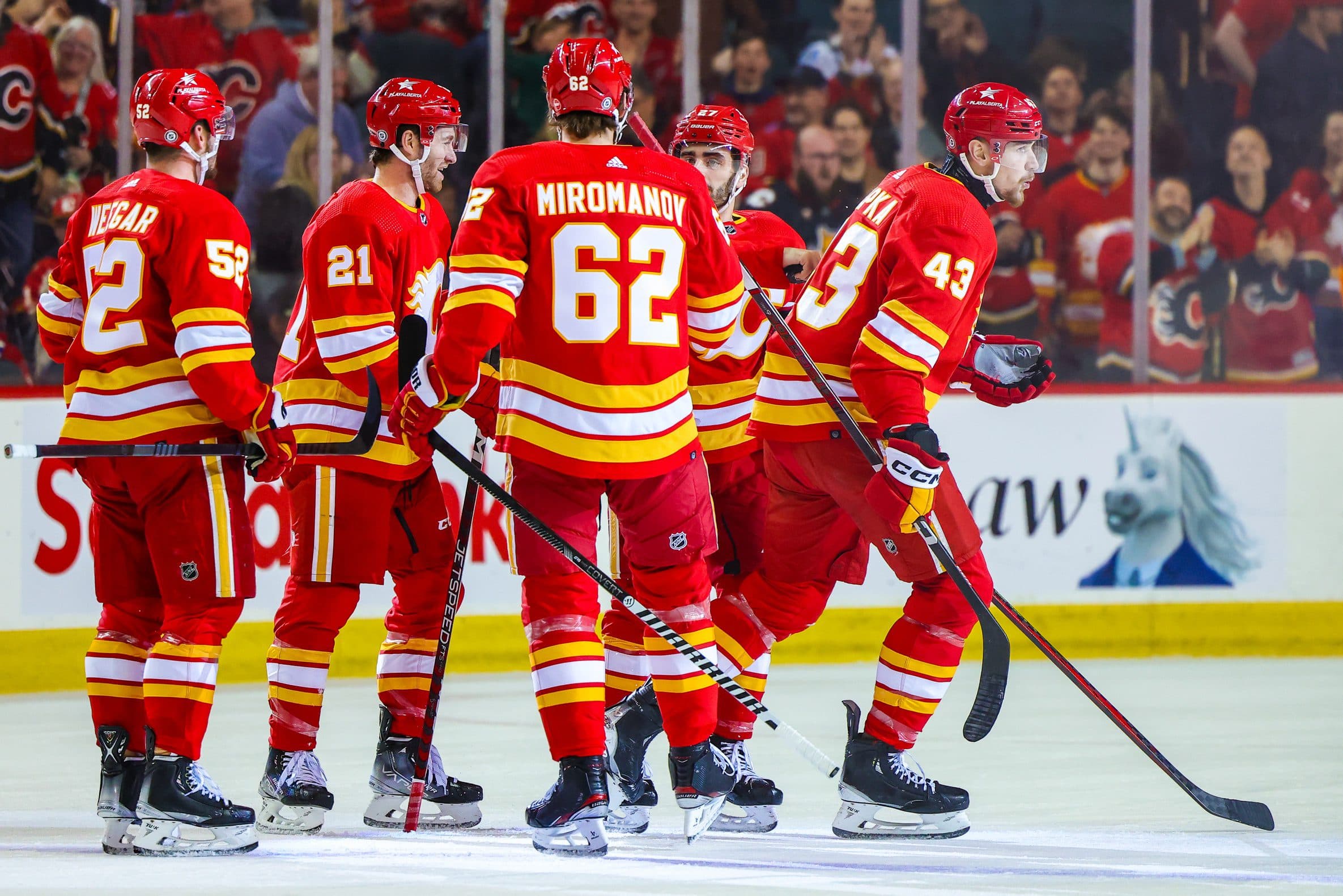
1. Calgary Flames
Mike: 1st
Scott: 1st
Colton: 2nd
Mike: Fans in Calgary clamored for years (if not decades) for the Flames to return to their original color scheme, and they finally answered those calls back in 2020. Many people think the Flames actually lightened the red they use when they moved back to their “retro” jerseys, but they’ve actually always used the exact same shade — the absence of black on the uniforms just makes it look brighter. The Flames may not make the playoffs for the next few years, but they’ll look good as long as they keep wearing these.
Scott: Yeah, it’s just a great mix of a vintage style while also continuing to look clean today. They’re called the Flames after all, they should have a combo of red, yellow and white on their jerseys. That said, there is a bit of nostalgia for their other main jersey due to its ties with Jarome Iginla.
2. Buffalo Sabres
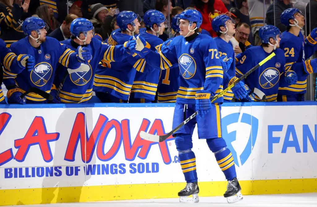
Mike: 2nd
Scott: 2nd
Colton: 1st
Scott: For a franchise well known for being terrible year after year, it’s a shame that they have two of the best jerseys in the league at their disposal. I love the black, red, and grey jerseys with the buffalo head, but the royal blue jerseys with their current logo are also very iconic. I just can’t believe they thought it was a good idea to roll out a version of these with (retches) navy blue.
Mike: Yeah, the navy blue ones lasted way longer than they should’ve. They were excessively detailed and didn’t stand out in any meaningful way. The royal blue looks so much better in every way, and I absolutely love the little embroidered accents in the logo. It’s one of the classiest uniforms in the league.
Colton: Everything about this jersey is just beautiful.
3. Edmonton Oilers

Mike: 5th
Scott: 4th
Colton: 3rd
Colton: The blue and orange colour scheme just makes me happy and I think that colorway goes very well together no matter what sports team it is. For a handful of years the Oilers reverted to dark navy jerseys during the Reebok era and that was horrific, so the return to the blue and orange brings fans back to the Gretzky days.
Mike: The Oilers’ old orange Adidas jerseys were so bad. The colors all looked wrong — the orange was too light, the navy was too dark, and the perforations in the numbers looked bizarre from any distance. The Battle of Alberta is now the best-looking rivalry in the league with the Oilers and Flames both wearing beautiful jerseys.
Scott: Yup, this is the Edmonton Oilers jersey. Too many years of the McDavid era have been wasted because they insisted on using the orange primary jersey when these are just iconic.
4. Pittsburgh Penguins
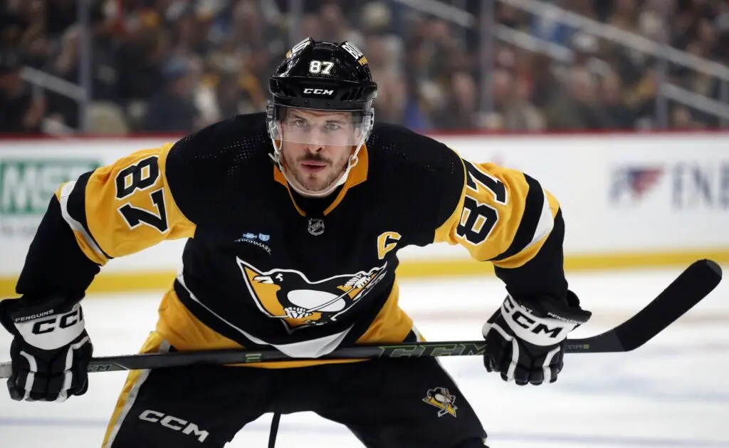
Mike: 7th
Scott: 6th
Colton: 5th
Mike: I always had a soft spot for the jerseys Pittsburgh wore when Sidney Crosby first entered the league — the “Vegas gold” always looked so sharp — but these are undoubtedly the Penguins’ iconic uniforms. It’s funny how it works: Calgary is a city of red teams, Seattle’s teams all wear navy blue, and Pittsburgh is a black and yellow city. These jerseys are just so irrevocably associated with winning and always will be.
Scott: For once, I completely agree with Mike. The Vegas gold look has a bit of nostalgia because of Crosby, but the current jerseys just scream Pittsburgh.
5. Toronto Maple Leafs
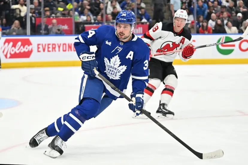
Mike: 11th
Scott: 3rd
Colton: 8th
Scott: I will fully admit my bias with ranking the Leafs third, as I do see this jersey the most. But after years of having to look at the boring Ballard-era Leaf logo and jersey, the look for the past 10 years is just so nice and clean. Plus, in a league including plenty of teams with blue, it says something that the Leafs are the first team most probably think of for that color, whether they like it or not.
Mike: These are the best jerseys the Leafs have worn during my lifetime. They’re simple yet striking. They fall right into the same category as teams like Montreal and Detroit for me.
6. Montreal Canadiens
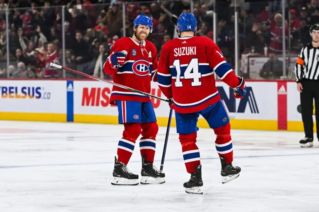
Mike: 8th
Scott: 8th
Colton: 7th
Colton: This is a classic jersey. I mean, we’re talking about a piece of history right here. The blue, red, and white colour scheme is just so recognizable and Montreal has never made any major changes to their jersey throughout the 100+ years they’ve been in the NHL, which I think is a great nod to the past players and fans.
Mike: I know lots of Habs fans want them to ditch the “toilet seat” collar on these but otherwise, it’s hard to find any faults with the classic blue, blanc, et rouge.
Scott: Agreed, you just can’t mess with an iconic look, although I do think their reverse retros with the blue as the primary colour was as good of an attempt as any to create a fresh look and is underutilized.
7. Boston Bruins
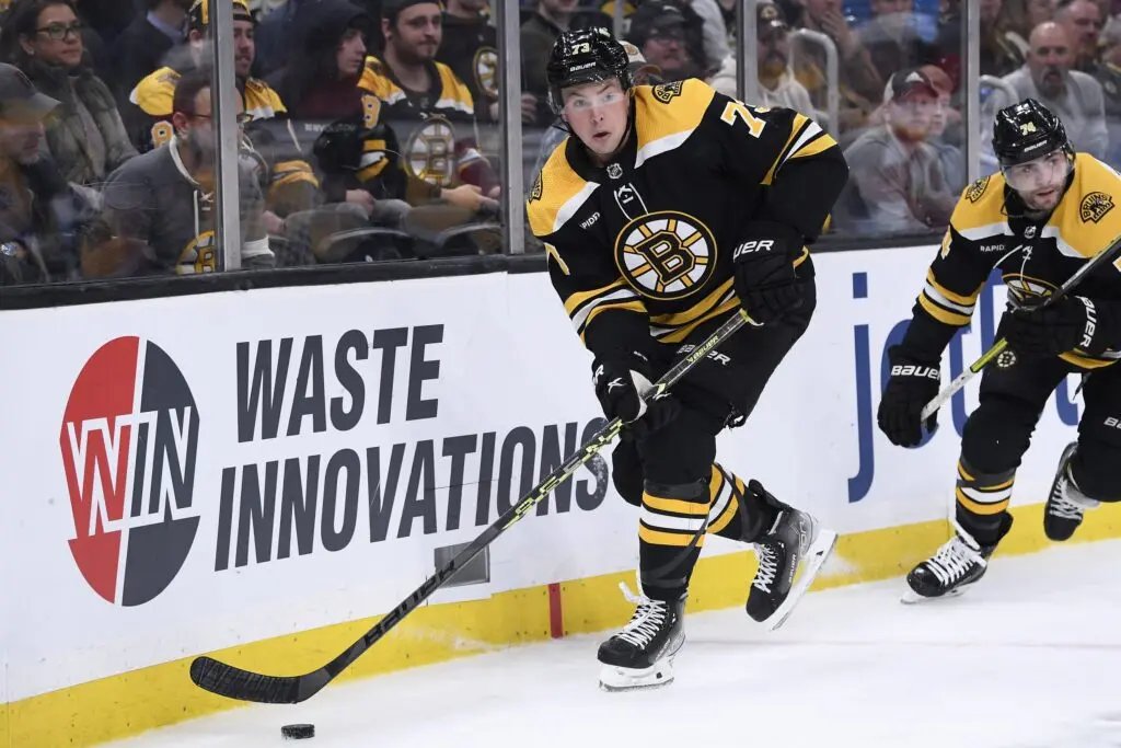
Mike: 13th
Scott: 7th
Colton: 9th
Mike: I still think Boston would be better off with a slightly simpler look, but these are perfectly reasonable and classic jerseys for an Original Six franchise. I think they’d be improved by removing the shoulder yoke and some of the outlines on the Spoked B logo, but it isn’t a bad look as it is (and it’s certainly much better than the uniforms they wore for their centennial celebration in 2023-24).
Scott: I will admit that the only reason I have the Bruins ranked as high as they are is because seeing these jerseys after seeing the atrocious 2023-24 jerseys, these feel like a familiar friend. I do like the original Orr-era look that they tried to replicate with the centennial jerseys, but it just feels like they left them out in the sun too long and they lost all their colour.
8. Los Angeles Kings
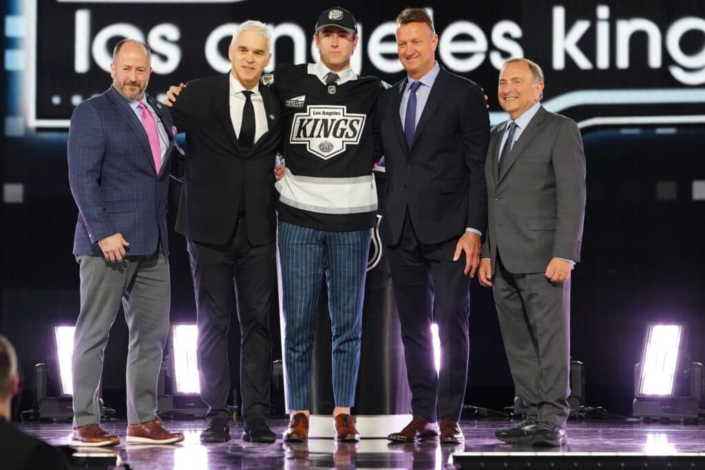
Mike: 10th
Scott: 10th
Colton: 10th
Scott: I chuckled at the fact that we all ranked the Kings 10th and yet they are 8th in the aggregate ranking. I’m so glad that they’re going back to the Gretzky-era look, so they get big points, but the only thing holding them back from a top-five spot for me is that ugly stripe at the bottom of the jersey.
Mike: The stripe really does look too big, doesn’t it? It might look better on the ice but I’m already starting to second-guess myself for ranking them so high, even if these are undoubtedly an upgrade over what they wore before.
Colton: The change to the Gretzky-era look is so refreshing.
9. Detroit Red Wings

Mike: 9th
Scott: 11th
Colton: 11th
Colton: Detroit’s winged wheel has been around since the 1930s and has become a staple among Detroit fans with a logo I consider top-five. While there have been minor cosmetic changes to the jersey throughout history, the winged wheel has primarily stayed the same and for two whole decades the jersey stayed the same. Once again, it’s a nod to history and the roots of the Original Six.
Mike: I’ve always been a big fan of the arched player names on the back of every Red Wings jersey. It’s a subtle touch but it gives a pretty basic-looking uniform the perfect dose of character. No, there’s nothing flashy about Detroit’s uniforms, but they’re a great match for a Red Wings franchise with a rich history of being the class of the NHL.
Scott: I grew up surrounded by Red Wings fans, so I always enjoy the look of their jersey. It’s simple, but it’s iconic. Admittedly, it gives them no room for making other jerseys because they don’t have any other colors that they consistently use, so every jersey will be worse (although I do wonder what a black alternate jersey would look like). My only other note is that these jerseys drop much closer to the bottom during the preseason thanks to the weird nameplate font that they use then.
10. Vancouver Canucks

Mike: 22nd
Scott: 5th
Colton: 6th
Mike: For whatever reason, I’m just not as sold on these Canucks jerseys as Scott and Colton. I’ve actually always preferred the uniforms they wore back in the early 2000s with the red and silver accents. I don’t dislike Vancouver’s current color scheme, but I think the uniforms themselves look a bit dated and could be improved with a mild refresh. (I’m not all that hot on the Flying Skate, though).
Scott: Much like the Leafs, there’s a bit of nostalgia in my choice with this one, as I became a hockey fan during their 2011 run, so I just like the look. That said, Mike is objectively wrong on both fronts of his preferences: the red and silver accents is a lot more boring, and while the Flying Skate is a bit chaotic, it’s still an iconic look.
11. San Jose Sharks
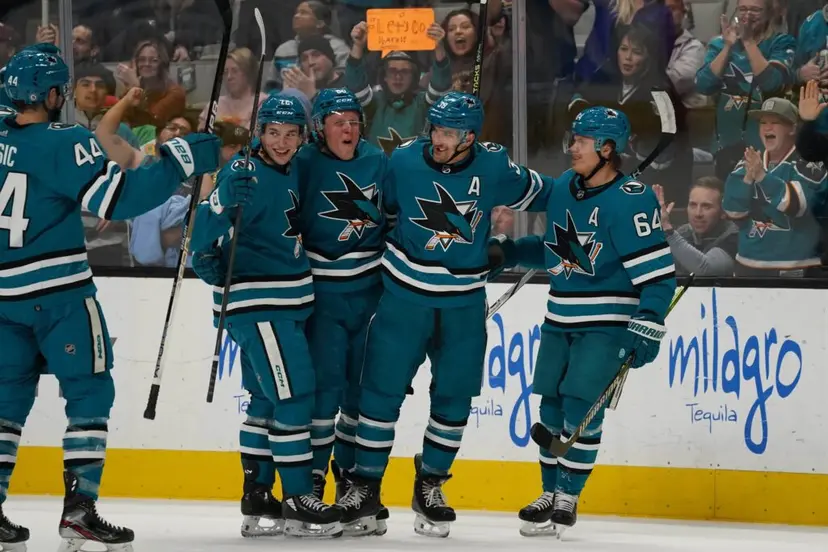
Mike: 6th
Scott: 15th
Colton: 15th
Scott: The Sharks have almost always had a great lineup of jerseys, as their unique colour scheme always looks slick on the ice. I do enjoy the vintage look of the current Sharks jerseys, but much like my criticism of the Kings jerseys, they lost some points for what they did with the stripes at the bottom.
Mike: It only just occurred to me that all three California-based NHL teams just went through significant rebrands. The Sharks did it first, and I think they did the best job. I love the teal helmets and pants, I think the striping looks great (c’mon, Scott!), and the number font on the back is distinctive while also not being too out there. Macklin Celebrini is going to make these jerseys iconic.
Scott: The striping is fine, it just could be done better.
12. St. Louis Blues
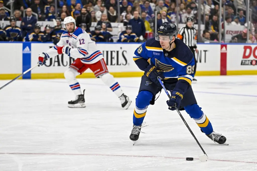
Mike: 4th
Scott: 20th
Colton: 12th
Colton: I probably could have ranked these higher. As a kid in the early 2000s, these were one of my favorites. The blue, navy, and yellow just flows together so perfectly. If St. Louis makes their home jersey the baby blue jersey that is currently their alternate, I would have them top-five.
Mike: I disagree wholeheartedly, Colton. If St. Louis ever goes back to the powder blue jerseys, they’ll sink like a stone on my own rankings. I remember being relieved when the Blues ditched their awful Reebok Edge jerseys to go back to this look in 2014. The two tones of blue just look way more timeless and stylish to me than the retro jerseys, which give off 1973 vibes in all the worst ways. The Blues won the Cup in these — if anything, that’s a sign.
Scott: These are fine, but I much prefer the classic version of their jerseys, which is basically just the same jersey without the navy blue.
13. Anaheim Ducks
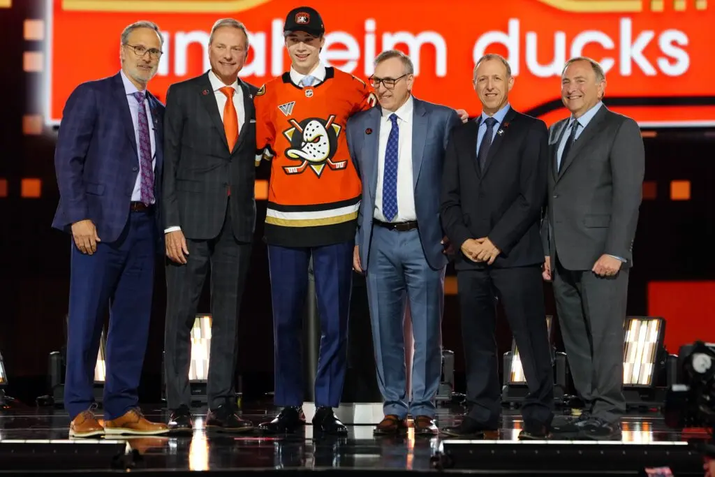
Mike: 12th
Scott: 12th
Colton: 13th
Mike: Had we made this list a year ago, Anaheim probably would’ve finished near the bottom. It seems the three of us agree that the Ducks made a good decision in going back to the old Mighty-era logo, even if they didn’t fully commit to their retro look. I think the jade and eggplant color scheme is wonderfully unique, but I understand why a team in Orange County would want to tie itself to orange this much.
Colton: Agreed with Mike, the switch to the Mighty-era logo is amazing. While I also would have loved the eggplant scheme, the orange really pops.
Scott: The only thing stopping this from being a top five jersey is the lack of the eggplant. I get the desire to stick with the Orange County brand, but you can’t tease me with the classic look and not go all the way.
14. Ottawa Senators

Mike: 3rd
Scott: 22nd
Colton: 14th
Scott: Wow, we were really divided on this one. In fairness to the Sens, every jersey I ranked from 4th to 29th is basically a toss-up with minor things here and there making the difference. I do like the Sens’ new look, especially with the classic logo, but I think I like the red version of the jersey that they ran as a reverse retro in 2021 over the black ones, so that’s why their ranking takes a bit of a hit.
Mike: Some teams just look better in black, and the Sens are one of them. They’re the only Canadian team to use it as their primary color, and that’s the way it should be. I would love to see them come out with a red alternate — their old NHL 100 Classic jerseys would be great — but the fans in Ottawa love the 2D Centurion logo and I’m right there with them.
Colton: The 2D logo is so cool. I agree with Mike, the Sens look much better in a black jersey.
15. Tampa Bay Lightning
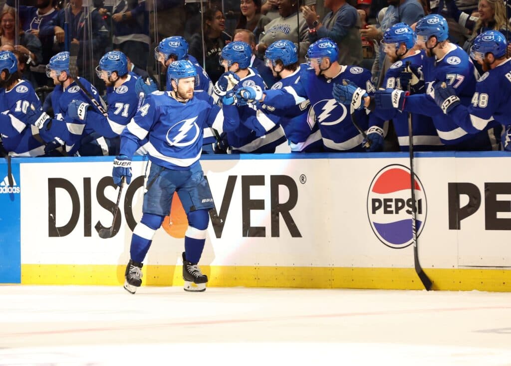
Mike: 21st
Scott: 14th
Colton: 17th
Colton: I will agree that I like the old black Bolts jersey better, but it’s hard to deny that the current home jersey doesn’t look slick with their current logo. Tampa had a couple of years in the 2010s where their jerseys looked horrible, but I have enjoyed the blue and white colour scheme even though it’s very Toronto-like.
Mike: There’s nothing about these Lightning jerseys that looks “electric” to me. They’re just so derivative. I’m not sure what I’d do differently, but I wonder about going with a shade of blue that’s a little bit closer to aquamarine.
Scott: I like the blue and white look, but I agree that the classic black, white and blue look is the best, while also not being a complete rip-off of the Maple Leafs.
16. New York Islanders
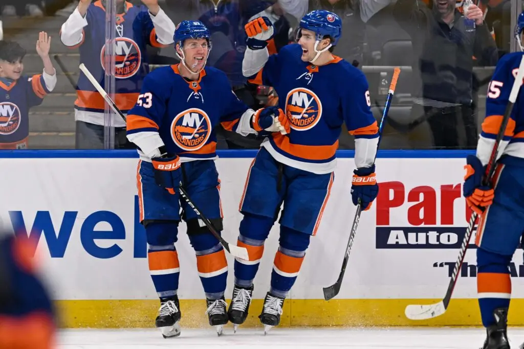
Mike: 14th
Scott: 21st
Colton: 18th
Mike: It’s funny: I like the Oilers better in royal blue, but the Islanders look better in navy. As it is, I think they look a bit too much like the Oilers in their current uniforms. Sure, sure, they both donned these colors at the same time in the 1980s, but the Islanders were a navy team for a long time and wore it pretty well.
17. Philadelphia Flyers

Mike: 17th
Scott: 19th
Colton: 20th
Scott: I mean, it’s a classic look, you can’t complain about it. I think I might prefer the cleaner versions that they ran for most of the 2010s, but the ones they have right now also look very nice.
Mike: I like these jerseys a bit more than their 2010s ones, but these fall right in the mushy middle for me. I do think the Flyers’ contrasting nameplates have run their course — they’re too clever by half.
18. Washington Capitals
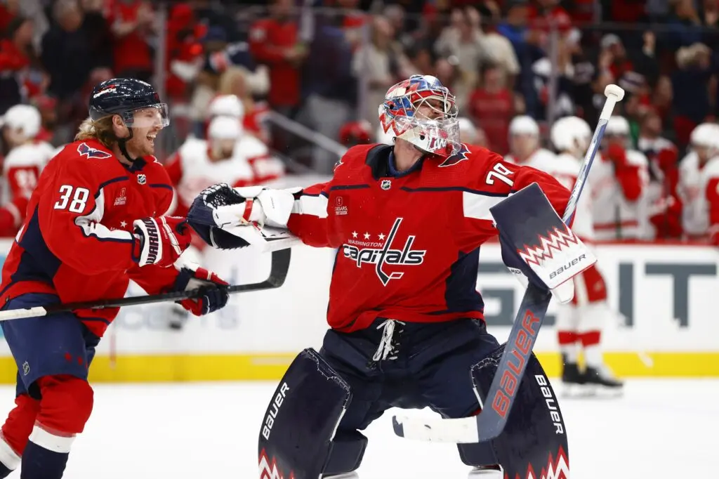
Mike: 29th
Scott: 9th
Colton: 19th
Colton: Yes, the Capitals home jersey is a bit “plain” in some sense but I find with how their logo is, the red really makes it pop. Yeah, the black screaming eagle Reverse Retro jersey is 100% better and should be their home jersey, but I do like the red homes they have.
Mike: I think I like every other jersey the Capitals have worn more than these ones. They very much look like relics from a bygone era. I don’t mind the Caps wearing red, but I think they’d be better served by going with the first Reverse Retro jerseys they wore back in 2021. Talk about a perfect mix of the past and present.
Scott: I think there’s just a nice clean look to it, although it’s one of the few jerseys that I think looks better in white than in red. I’m personally more of a fan of the old-school ones that had a better shade of blue.
19. Seattle Kraken
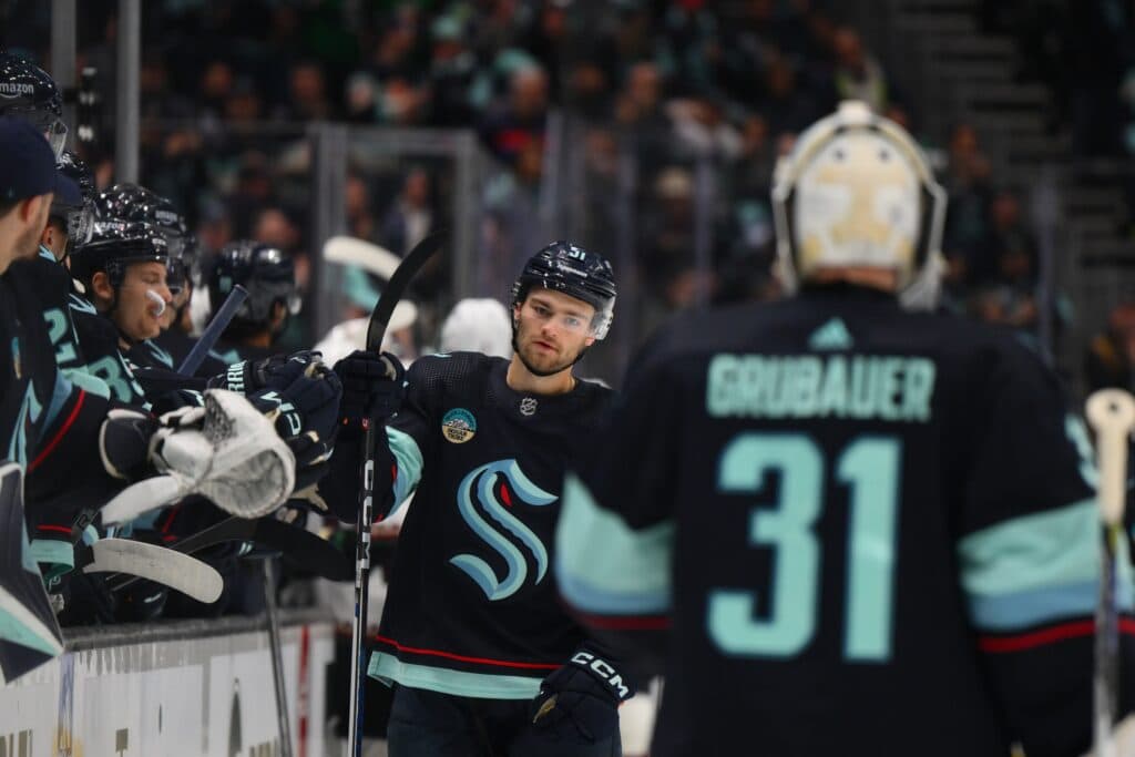
Mike: 18th
Scott: 16th
Colton: 24th
Mike: Look, they’re fine, and it’s a bit hypocritical of me to suggest navy blue jerseys are a bit too commonplace after suggesting the Islanders should go back to theirs, but I think the thing that knocks these down a bit for me is the lack of contrast. There are plenty of navy jerseys I like; Seattle’s are just overwhelmingly so. Maybe a bit more red would make these pop more.
Colton: If they used that like “ice blue” or whatever color that is as a main colour, I think that would absolutely make the jersey pop.
Scott: I do think the clashing blues make it interesting as far as navy blue jerseys go, but I definitely think ice blue as the main color would be a huge upgrade.
20. Dallas Stars
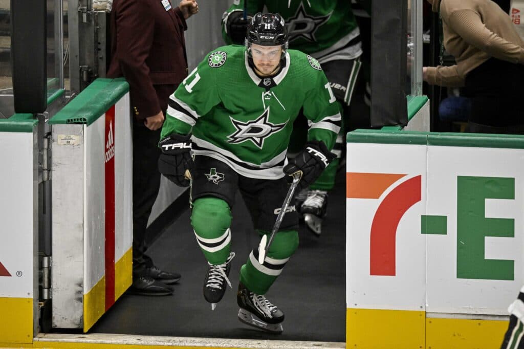
Mike: 20th
Scott: 18th
Colton: 21st
Scott: It’s weird, I think the Stars’ color scheme is one of the best in the league, or at least the most unique. And yet, something about the jersey just doesn’t fully click. I think for me the issue is the logo, as I’d love to see the classic logo on this jersey. It sure beats the boring black “DALLAS” jerseys, but I think they could do better. Like the neon green blackout jerseys, those are much better.
Colton: Those “DALLAS” jerseys were the death of me, throw all of them in a fire. I agree though, one of the best colour schemes probably in all of sports but something isn’t right.
Mike: A few little tweaks to the striping and collar would make these vastly better, IMO.
21. Chicago Blackhawks
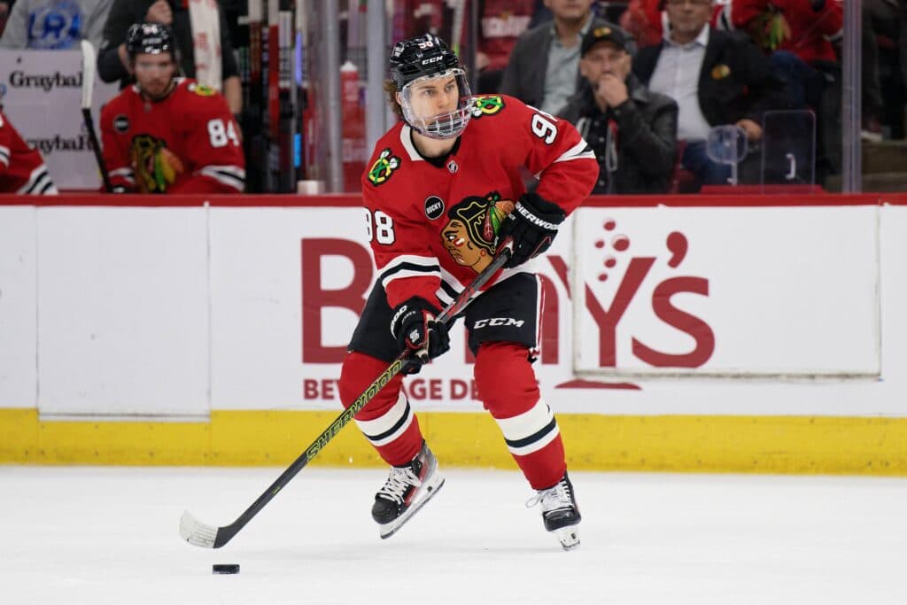
Mike: 31st
Scott: 24th
Colton: 4th
Colton: Yeah so the reason this one is so high for me is because I am staring at a Connor Bedard home jersey right now and it’s very hard to deny how beautiful the jersey is. Yeah I get the controversy around the logo and such, but it’s undeniable that the whole look is iconic.
Mike: I don’t mind Chicago’s colors and striping, but I’m afraid the logo is a non-starter for me. Just my two cents, but I think there’s a way for them to move forward with a less divisive crest while keeping a jersey template that is undeniably striking. The Portland Winterhawks did a wonderful job with their own rebrand a few years ago.
Scott: Yeah, the jerseys are fine, but they just aren’t good enough to compensate for the logo. I feel like most redesigns I’ve seen of their logo are so much better than what they still use.
22. Colorado Avalanche
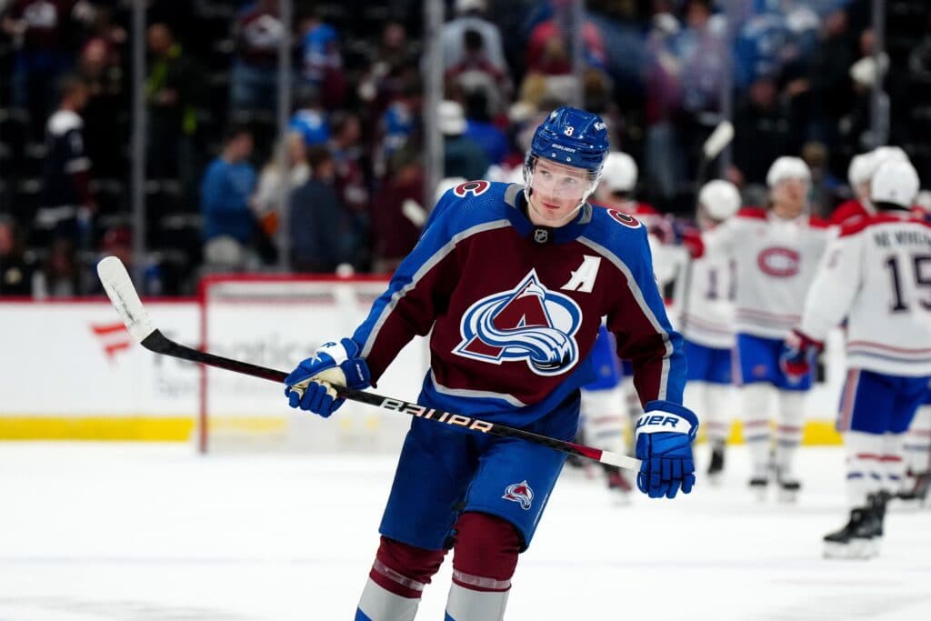
Mike: 19th
Scott: 25th
Colton: 16th
Mike: I’ve long maintained that these jerseys would look a lot better if Colorado darkened the shade of blue to navy. Replacing the silver stripes with white ones would help a fair bit, too. I think it’d make for a much more cohesive and dynamic look — for my money, these just look a bit too washed out. I certainly don’t have anything against a maroon jersey, and I like the striping pattern on these, but I think the whole look would come together more easily with a few small changes.
Scott: This might be the one time that I support changing a color to navy blue, it might create less of a clash of the two colors. They are nice, I just can’t really say why they don’t click for me.
23. Vegas Golden Knights
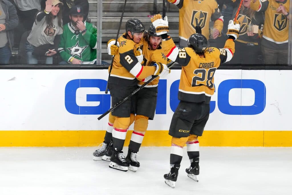
Mike: 23rd
Scott: 17th
Colton: 22nd
Scott: I thought my ranking was going to be the harsh one here. While the gold jerseys are more fitting for the team brand, I think I actually like the original home jersey layout a bit better. At the very least, it’s the one I always think of first when I think of the team, even though they lifted the cup in the gold jerseys.
Mike: I actually like the special sparkly gold fabric the Knights created with Adidas for these, but I preferred them as alternates. I’d like to see Vegas shift the grey jerseys back to primary status.
24. Nashville Predators

Mike: 26th
Scott: 13th
Colton: 26th
Colton: Man, if they went away from that disgusting yellow colour and switched to navy, Nashville would be much higher on this list. Easily one of the coolest logos in sports, but what the heck are we doing here with this yellow as the home jersey?
Scott: I can understand why this is not for everyone, but when their other options involve navy, I gotta go with the yellow jerseys. At least they’re unique.
Mike: My eyes! I liked the Preds a lot more when they wore grey and navy. The yellow is just overwhelming. No thank you.
25. New York Rangers

Mike: 15th
Scott: 29th
Colton: 23rd
Mike: I must admit, I’m a little surprised to see these ranked so low. There’s nothing wrong with them. If anything, these Rangers jerseys played an instrumental role in starting the trend of NHL teams using diagonal wordmarks for the better part of the last century. The colors and striping are classic and suitably “New York.” I think there are teams out there with more memorable and flashy looks, but I don’t have many complaints with what the Rangers wear.
Scott: The thing here is that you think a trend of NHL teams using diagonal wordmarks is a good thing. I rated the Utah jerseys much lower for this, but it borders on the feel of a college hockey jersey with the diagonal words if not for the legacy with them. They’re one of two teams that doesn’t use their actual logo on their jersey, and that just feels weird.
Colton: I’m with Scott, them not using their actual logo is what pisses me off about the jersey. SO much potential but nope.
26. Minnesota Wild
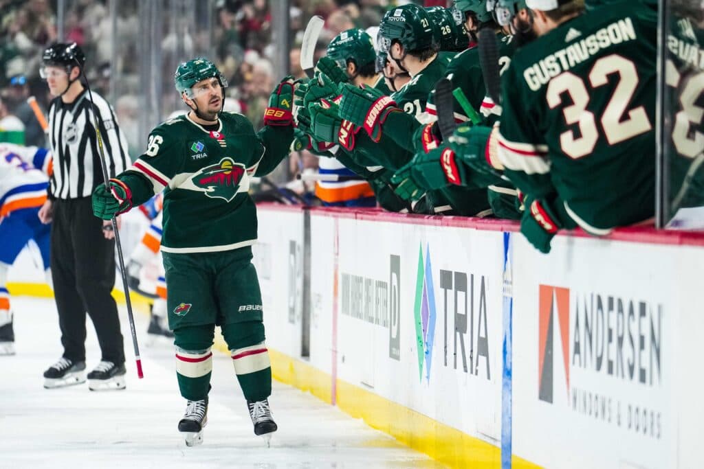
Mike: 16th
Scott: 27th
Colton: 25th
Scott: I will say, the Wild’s jerseys are very fitting. They’re kind of boring and forgettable, just like the team. It is a solid look and is at least unique, but I’m just not as sold on these jerseys, especially when the versions with the North Stars’ colors exist.
Colton: Yeah, switch to that North Stars color scheme and we are cooking, as the kids say nowadays.
Mike: I actually prefer Minnesota’s current colors, especially how the beige stripe behind the crest counteracts the forest green. I think it’s a bit overdone for teams to go back to their old bright colors at the expense of more nuanced modern looks. These do the job just fine.
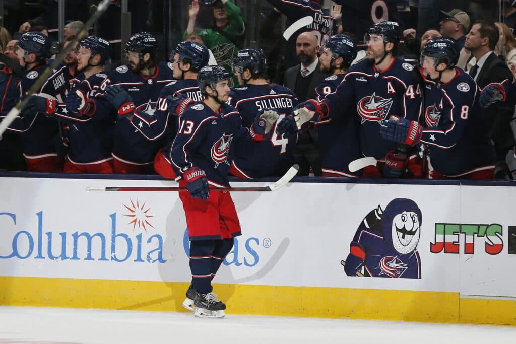
27. Columbus Blue Jackets
Mike: 28th
Scott: 23rd
Colton: 27th
Colton: Columbus has a jersey where you don’t even need to know where the city is and can tell it’s a jersey straight out of Ohio. The navy, red and white is just plain and I feel like they could do so much more with what they have available to them. The shoulder patch with the cannon is very cool though, I can agree with that.
Scott: It somehow manages to look interesting and boring at the same time, I will give them that.
Mike: Ssssssssnore.
28. New Jersey Devils
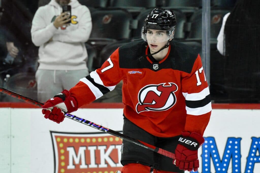
Mike: 27th
Scott: 26th
Colton: 28th
Mike: The Devils used to look a whole lot better on the ice than they do now. For whatever reason, they’ve stood by their ill-advised Adidas-era rebrand that did away with the waist stripe on their jerseys while awkwardly enlarging the ones on the arms. There’s a reason why the Devils never toyed with their uniforms under Lou Lamoriello’s leadership: put simply, they weren’t broken. Now, they just look wrong.
Scott: It’s the shoulders for me. They just feel awkwardly chopped off, and they’re the only team that don’t have a border around them.
29. Florida Panthers
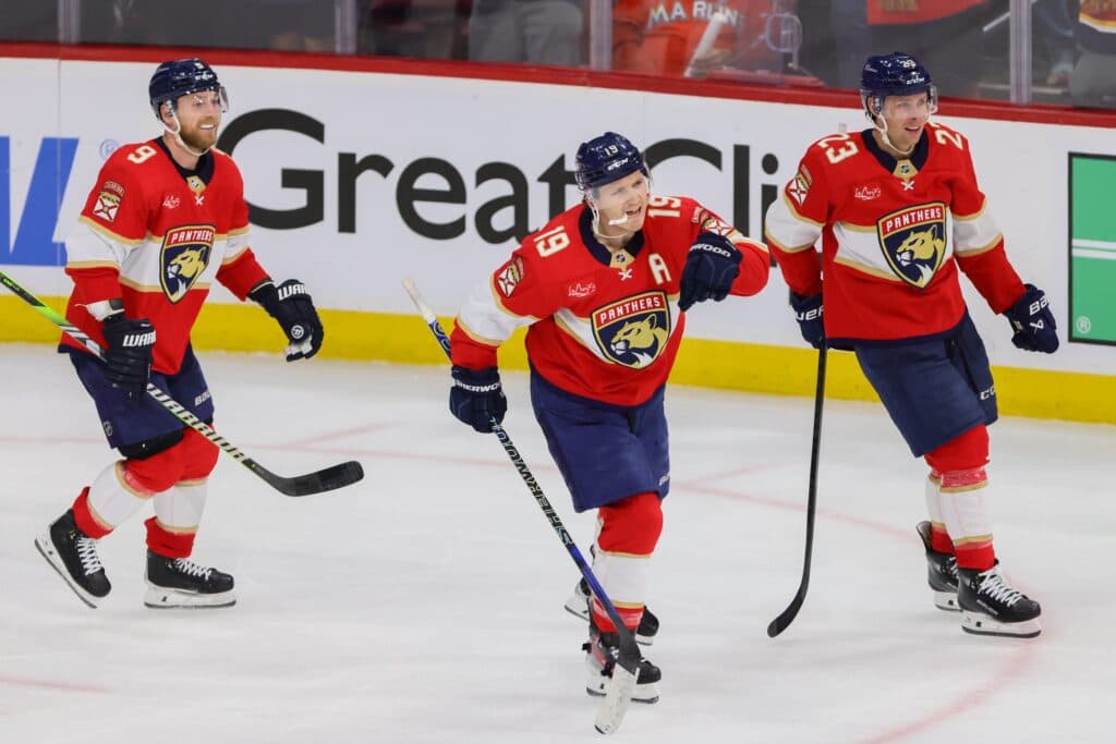
Mike: 24th
Scott: 31st
Colton: 29th
Scott: Remember when I said that only three teams wore jerseys that I actually didn’t like? This is one of them. It’s not that it’s bad, but I just cannot in good faith give them a good score when they use the boring logo that looks like it belongs in the MLS. If they could work the classic Panther logo on to this colour scheme, I’d be a lot more sold on these jerseys.
Mike: I dunno, Inter Miami wears way better uniforms than these.
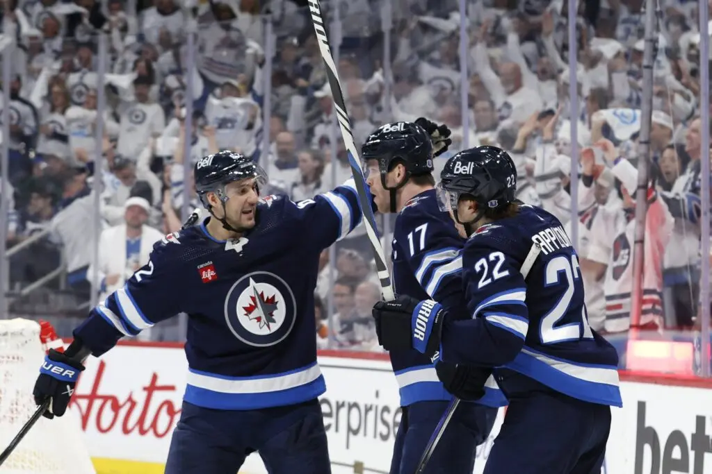
30. Winnipeg Jets
Mike: 25th
Scott: 30th
Colton: 31st
Colton: The Jets logo is just way too similar to the RCAF (even though it’s intentional), so first thing’s first, change that and then they’ll be much higher on my list. Secondly, the jersey itself is quite boring. Even if you didn’t have the rights to the old Jets logo and jerseys, you could have at least had a similar color scheme, right? The alternates with the throwback logo are perfect and are what the home jerseys need to be.
Scott: Everybody knows my thoughts on navy blue as a color to use for jerseys, so it was quite obvious that I was going to punish the Jets for using it. The logo isn’t terrible, but the jerseys just aren’t interesting to look at at all, especially with the previous Jets team having such an iconic look.
Mike: I remember liking these a lot when they first came out, but they’re undeniably dated at this point. It’s funny how trends change: Winnipeg is the only team in the NHL still using italicized numbers on their home jerseys. Back in the early 2000s, it felt like half the league was doing that.
31. Carolina Hurricanes
Mike: 30th
Scott: 28th
Colton: 30th
Mike: It was funny to see the Hurricanes bring back their 2006-era look as an alternate for one season, only to go back to their three usual jerseys — none of which are as good — immediately after. I don’t actively dislike Carolina’s black uniforms, but they worked way better as a third. The Hurricanes should be a red team. I’ve always been a fan of their red jerseys — they’re the only ones in the league that almost look pink, which I really like as a primary color for a hockey team (see: the Calgary Hitmen). The black ones just look like a bunch of other black jerseys in the league.
Scott: There are certainly some interesting details with the jersey that have some importance to Raleigh and North Carolina, but yeah, the red jerseys with their actual logo are much better.
Colton: I liked the throwback 2006-era jersey. I am not a fan of the black home jersey. While I get all the hidden details and importance that Scott pointed out, I find it’s a better alternate jersey.
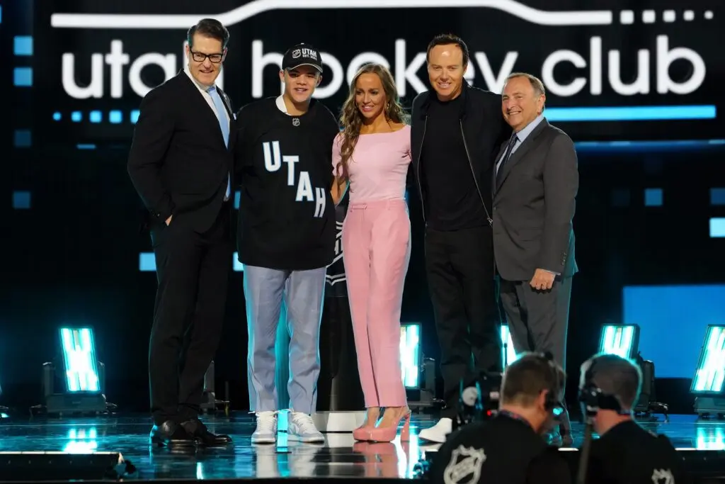
32. Utah Hockey Club
Mike: 32nd
Scott: 32nd
Colton: 32nd
Note: The plain black jerseys Utah used at the 2024 NHL Draft are not quite the same as the ones they’ll wear in their inaugural season. Click here for a closer look at Utah’s inaugural uniforms.
Scott: Poor Utah didn’t have anything to work with here, since they have neither a name or a logo, but this is literally a college hockey jersey. I don’t mind the colour scheme and I’m interested to see what they do with it when they have more of a brand, but we can’t give them a fair ranking with the unknown.
Mike: It’s funny that this franchise went from having some of the best jerseys in the league to the worst, but I guess that’s what happens when you move cities with almost zero notice. I’m actually kind of smitten with the idea of them keeping the “Utah HC” name, but they need to come up with a better jersey than this.
Scott: For the love of God, if they end up with Utah HC as their fulltime name, I will root for their downfall.
Colton: In one year they will be top-five on our list, just wait.
_____
Recently by Mike Gould
- One under-the-radar prospect who could play games for each Central Division team in 2024-25
- One under-the-radar prospect who could play games for each Pacific Division team in 2024-25
- Best of the rest: Alex Nylander, Oliver Kylington have the most upside of the remaining UFAs
- Tyler Toffoli is the best value bet of this year’s secondary UFA forward options
- Grading the Mikhail Sergachev trade: Utah upgrades on defense at a sky-high price
- Grading the Linus Ullmark trade: Senators stage a coup, Bruins faceplant
- Grading the Dubois for Kuemper trade: Washington and L.A. pull a stone-cold stunner
- Grading the Jacob Markstrom trade: Devils land big fish, Flames solidify lottery positioning
- The Calgary Flames have major decisions to make on five more players this year
POST SPONSORED BY bet365